Using your Style Guide
The Styles Guide can be accessed through the Studio Admin and is a huge asset when trying to quickly spin up page with a consistent brand, design, and voice.
<iframe width="560" height="315" src="https://www.youtube.com/embed/za7vIUrwhOk" title="Adjusting your Styles" frameborder="0" allow="accelerometer; autoplay; clipboard-write; encrypted-media; gyroscope; picture-in-picture; web-share" referrerpolicy="strict-origin-when-cross-origin" allowfullscreen></iframe>
Colors
Colors control your entire site's colors in the 7 different areas;
- Brand primary
- Success
- Warning
- Dark background
- Light background
- Dark text
- Light text
Success and warning can be green-ish and orange-ish colors, or anything you'd like. As for the rest, we suggest an online app like coolors.co for generating it.
What colors do we accept?
We accept HEX and RGB color codes.
Fonts
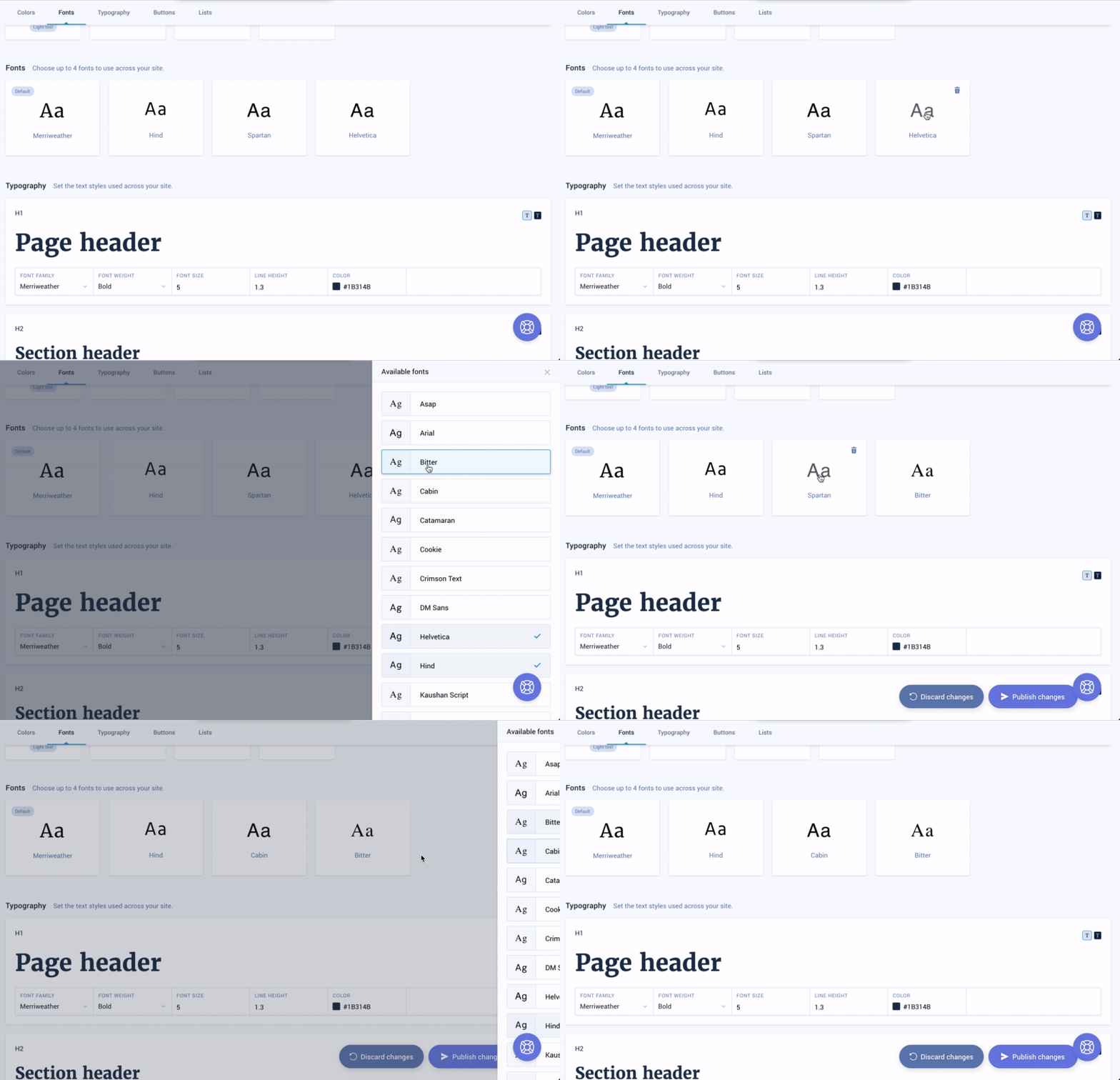
You can select up to 4 fonts to be used across your site.
How to change a font

Click the font you'd like to swap then select the new font you'd like to use from the modal.
Typography

- Font Family: the ability to select a font from your designated 4 fonts
- Font Weight: how thick or thin the font will appear
- Font Size: how large the text will appear (displayed in rem)
- Line Height: the spacing between lines
- Color: the color of this text
When using the styling tools, it's important to use the toggle tool for light and dark.
Buttons

Styling a button can be done within the style guide. You can control many different aspects through the four panels: text, shape, border, and hover.
Text: The look of the text within the button
- Font Family: the ability to select a font from your designated 4 fonts
- Font Weight: how thick or thin the font will appear
- Font Size: how large the text will appear (displayed in rem)
- Line Height: the spacing between lines
- Color: the color of this text
- Text shadow: a slight color behind the text to make it more apparent
Shape: The way the button looks.

- Background color: the overall background color of the button
- Height: the size of the button
- Shadow: a slight tint behind the button to make it more apparent
Border: The look of the line bordering the button

Border width: the size of the border
Border color: the color of the border (if border-width = 0 this will not appear)
Border radius: rounding of the button: higher the number, rounder the button
- 0px = Rectangle
- 15px = Rounded Rectangle
- 30px = Pill Shape
Hover: Controls the look of the button when it is hovered by the mouse

Background color: the color of the button on hover
Border color: the color of the border (border-width cannot be changed on hover)
Shadow: the tint behind the button
Opacity: the lightening of the button on hover, lower the number, lighter the color. 1 is the max.
Header

Within the header you can adjust the look of links, action, and hover which have been covered previously.
Main change here to call out, is how to adjust the look of the action link/button which may be done under action.

You can use that dropdown to toggle between primary, secondary, and action link.